Golden Our | Women’s Wellness Brand Identity
Project Goal
Create a warm, vibrant brand identity for a new women’s wellness company designed to help high-achieving women step out of burnout, reconnect with themselves, and restore their spark.
Why Soaring Heart
Allison and Adriana came to us with a meaningful idea and a strong sense of the women they wanted to serve, but the pieces were still coming together. They were even still solidfing their a name yet.
Through our early strategy work, we helped bring clarity to their vision and uncover the heart of what they were building. When they shared the name Golden Our during one of our strategy sessions, there were immediate goosebumps all around as we knew that would be the foundation to build the brand on. From there, they needed a creative partner who understood women-centered wellness brands, community, and how to translate a big, emotional idea into a distinctive brand identity people could see and feel.

What We Created
We developed Charged Peace, a creative direction for Golden Our’s wellness brand identity inspired by the warmth and radiance of golden hour and the balance between restorative calm and vibrant energy.
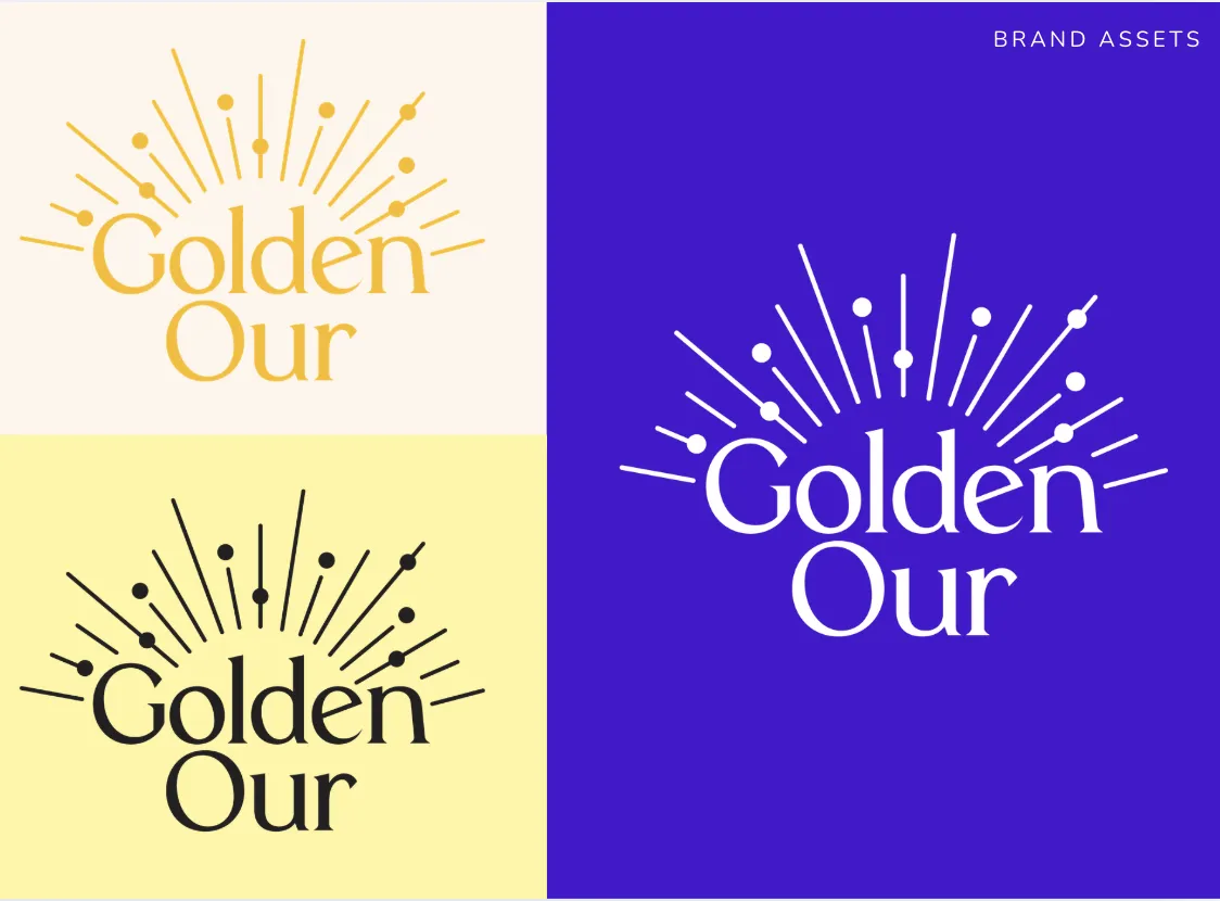
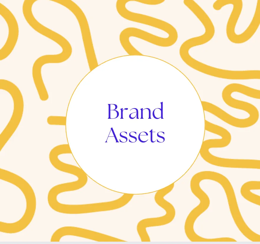
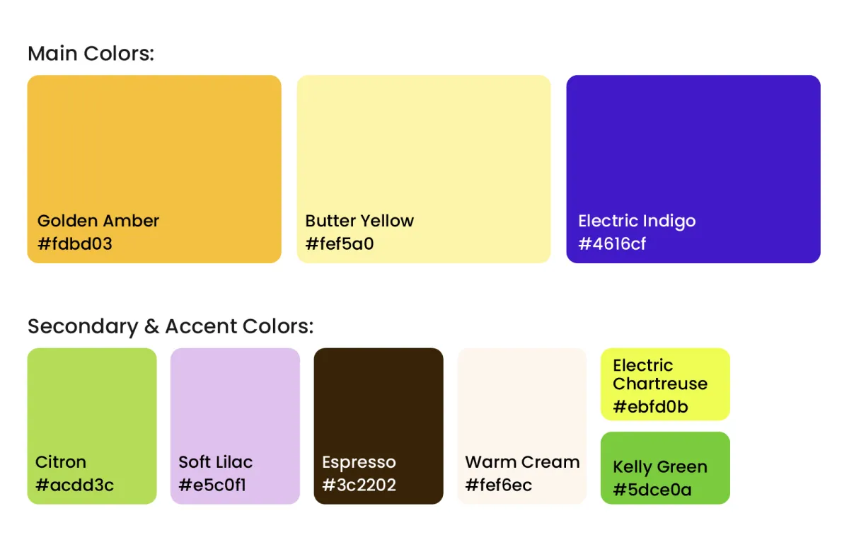
The identity pairs sunny yellows and warm neutrals with electric indigo, soft lilac, and energetic pops of green, creating a wellness brand that feels optimistic, feminine, expressive, and alive. Hand-drawn patterns and organic details add personality and movement, while the sun-inspired logo reinforces Golden Our's central idea of restoring the light within.
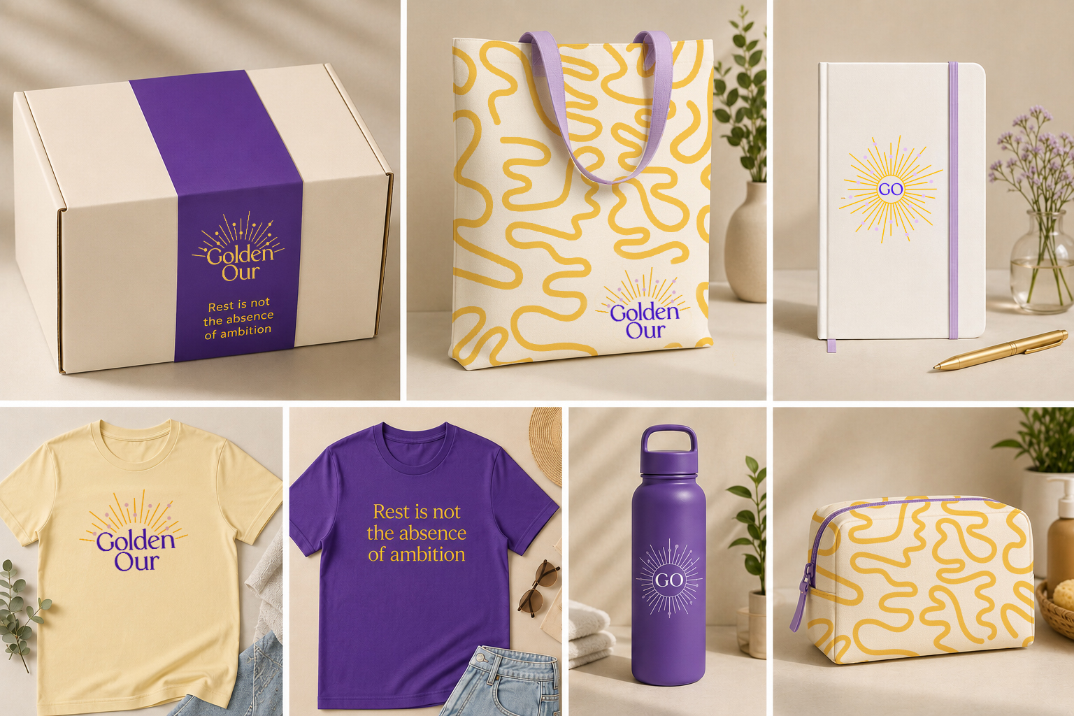
From the logo suite and color palette to typography, patterns, imagery, social applications, and branded products, we built a flexible visual system designed to grow alongside Golden Our's community, experiences, and offerings.

They came to us with an idea for a women’s wellness company. They left with a name, a clear creative direction, a distinctive brand identity, and a complete visual toolkit ready to bring Golden Our into the world.
DELIVERABLES
Creative Direction & Brand Narrative
Visual Identity & Logo Suite
Color & Typography System
Custom Patterns & Supporting Graphics
Imagery Direction
Social Media Applications
Branded Product Mockups
Comprehensive Brand Guidelines
Final Brand Asset Library

Take a Closer Look at the Golden Our Brand