Rowan Tree | Brand Identity & Experience Design
Project Goals
Build a warm, vibrant brand identity and cohesive member experience for a women-centered coworking community, creating a place where members could step away from everything they were carrying, make space for themselves, and find meaningful connection, creativity, and well-being.
The Vision Behind Rowan Tree
Rowan Tree began with a simple belief: women spend so much time taking care of everyone else that they often put themselves last. My business partner, Kate, and I wanted to create a place where women could focus, connect, recharge, and make room for whatever they needed next.
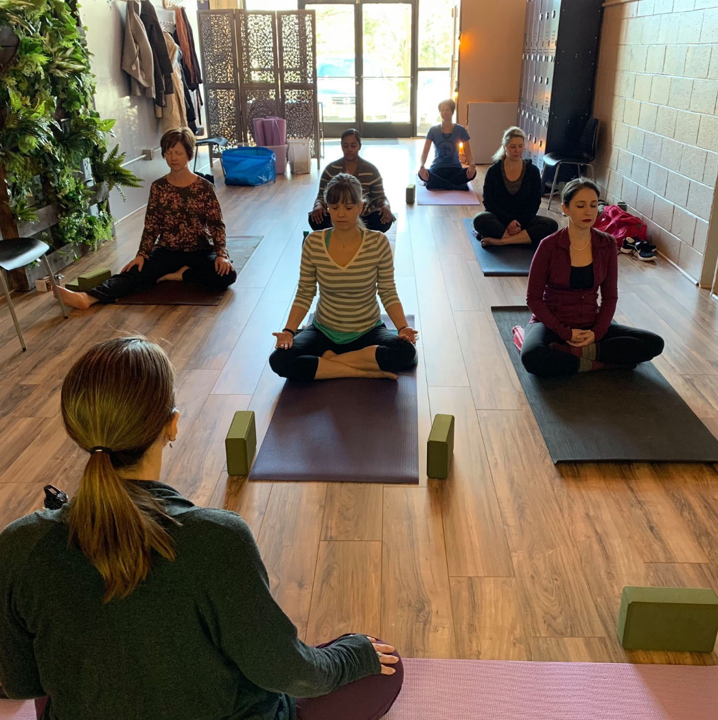
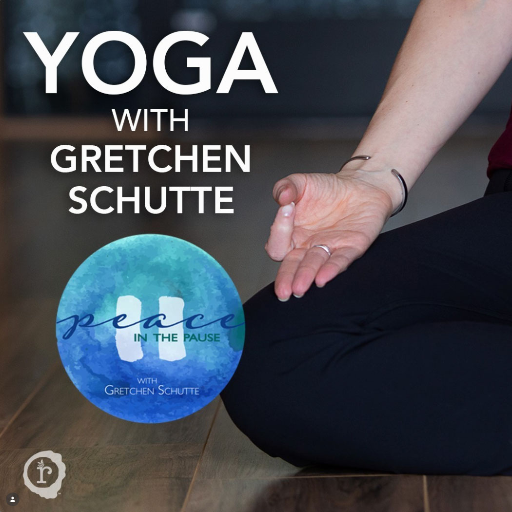
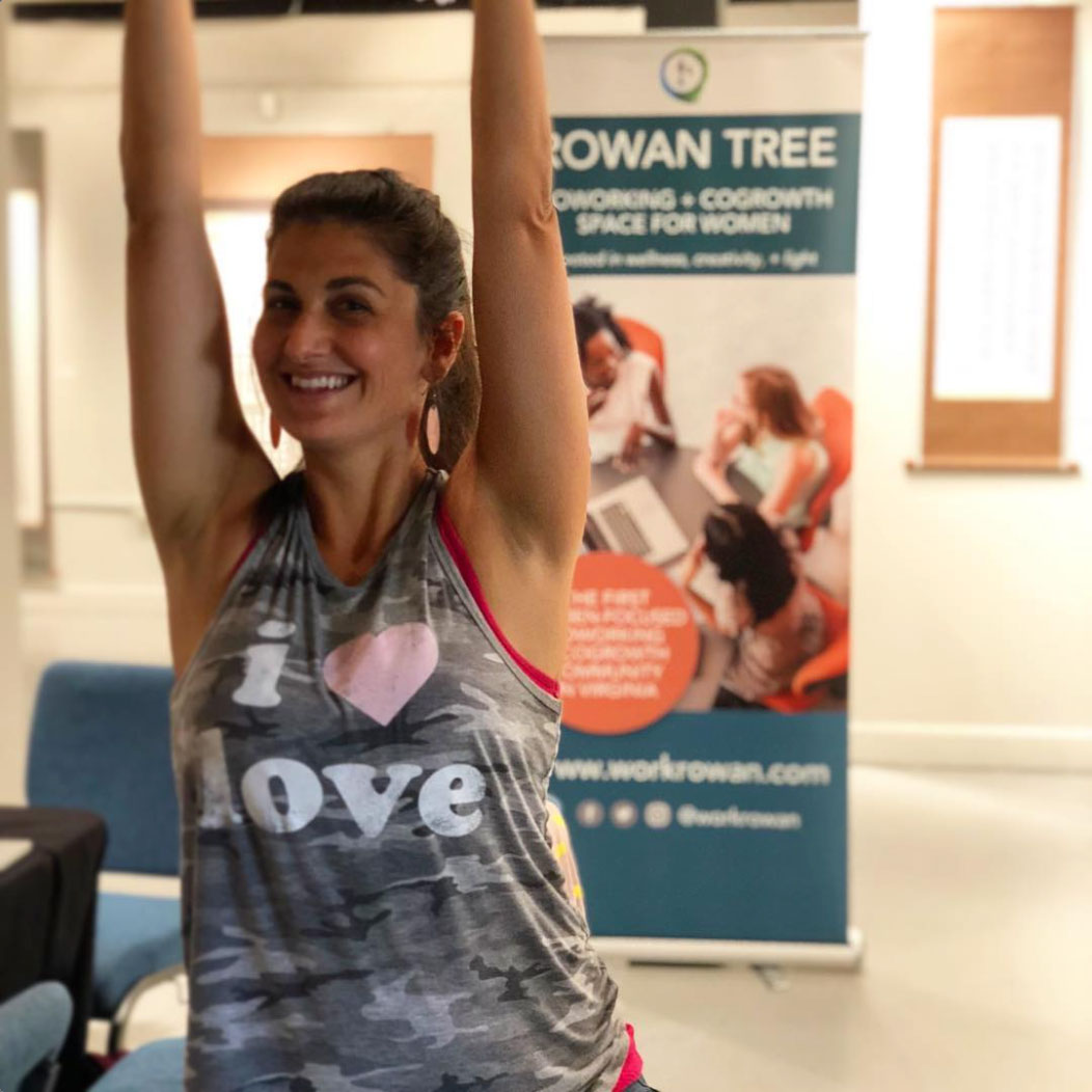
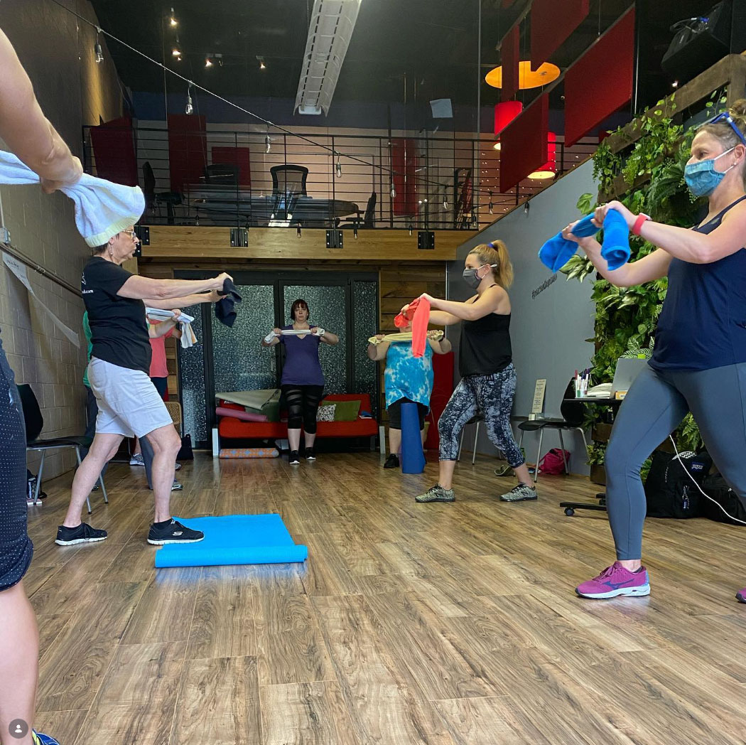
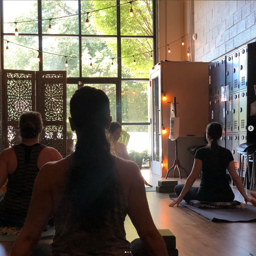
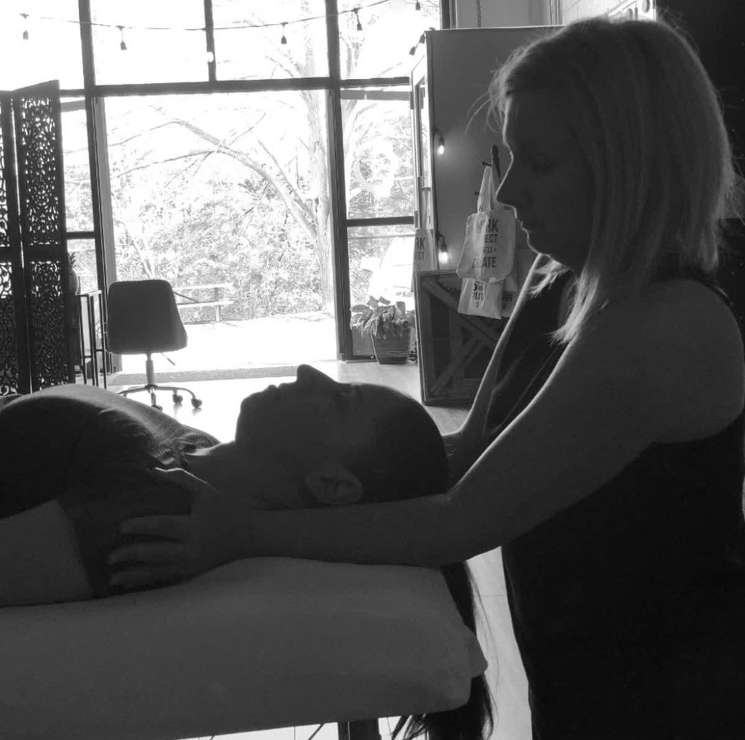
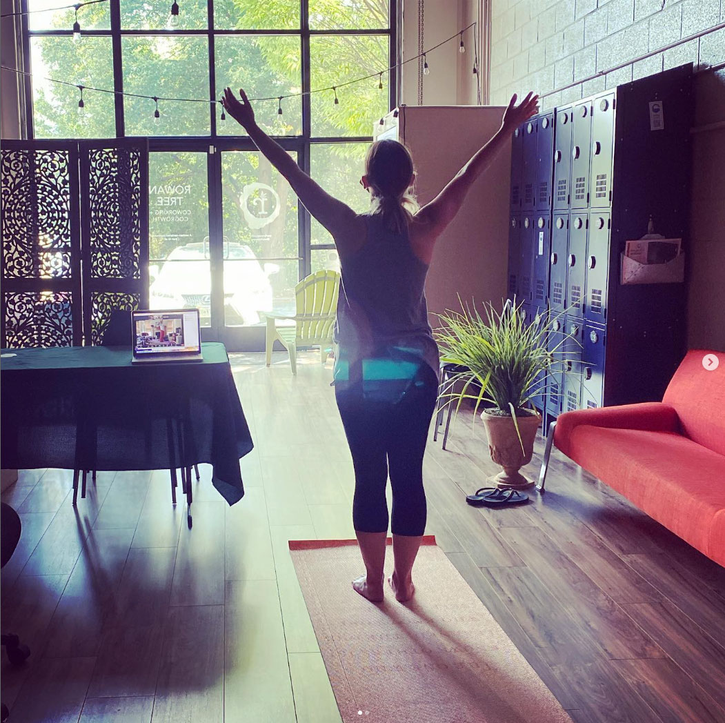
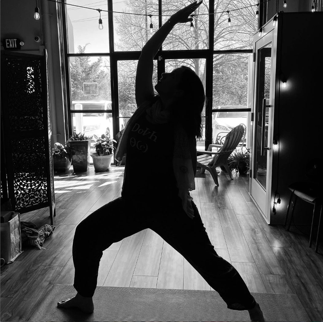
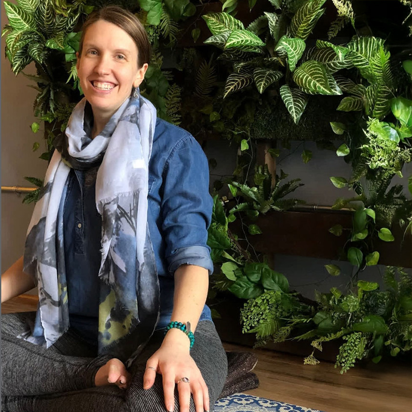
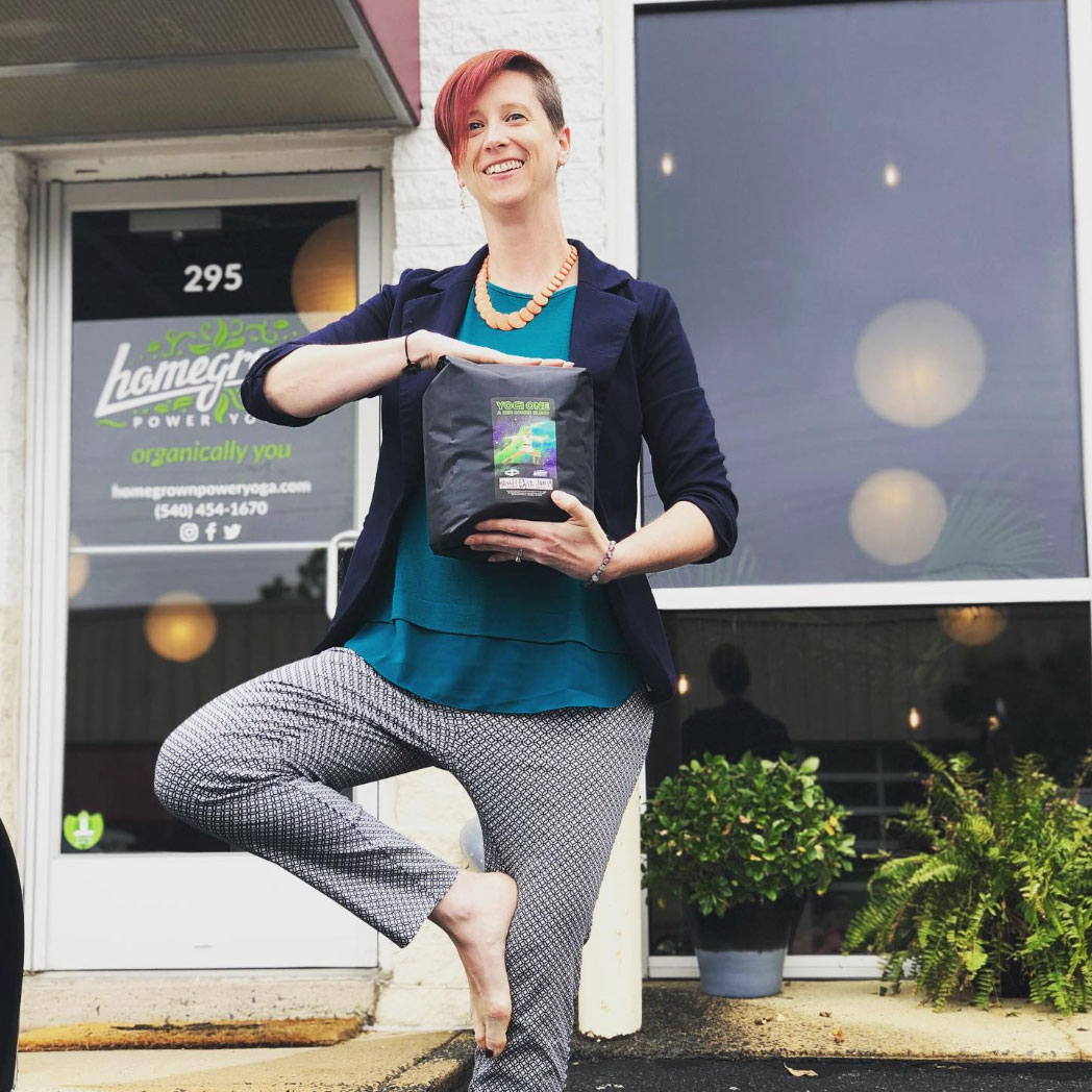
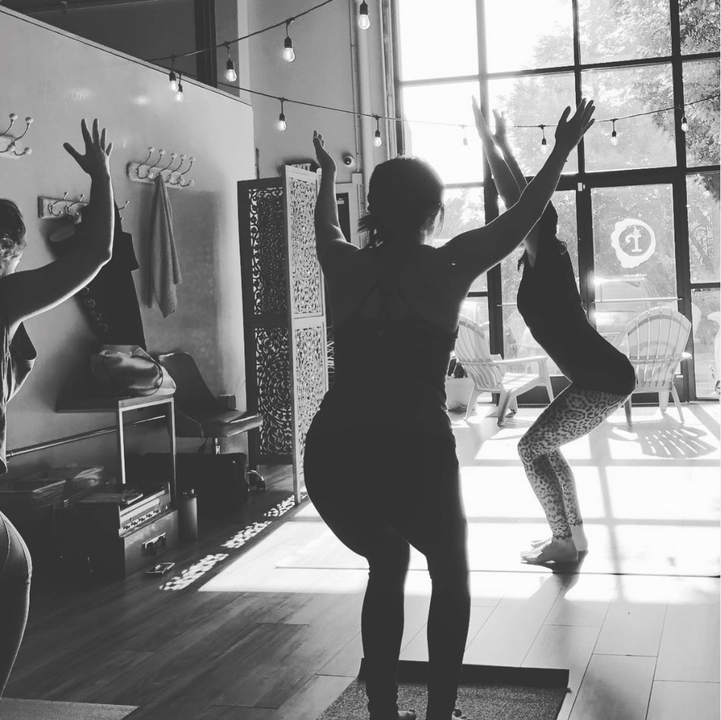
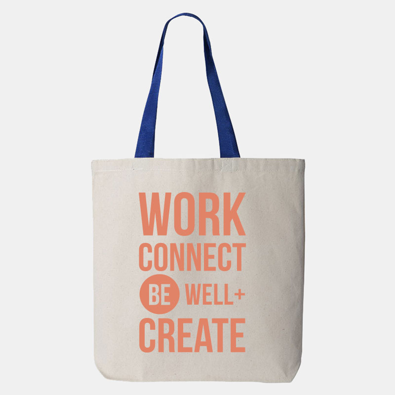
Our guiding idea became Work. Connect. Be Well. Create. Wellness wasn't an add-on to the coworking experience. It was woven into Rowan Tree from the beginning, from weekly yoga and wellness classes to conversations about mental health, strength, balance, visioning, and navigating the beautiful chaos of everyday life.
Building the Brand From the Inside
As co-founder and creative director, I had the unusual opportunity to build the Rowan Tree brand from the inside out, shaping not only how it looked, but how it felt to walk through the door.
The name itself was deeply personal. The rowan is the tree associated with the birthday Kate and I share, and its symbolism captured what we wanted the community to foster: vision, power, balance, connection, and transformation. Known as a portal tree, it became a fitting symbol for a place designed to help women move from where they were toward where they wanted to be.
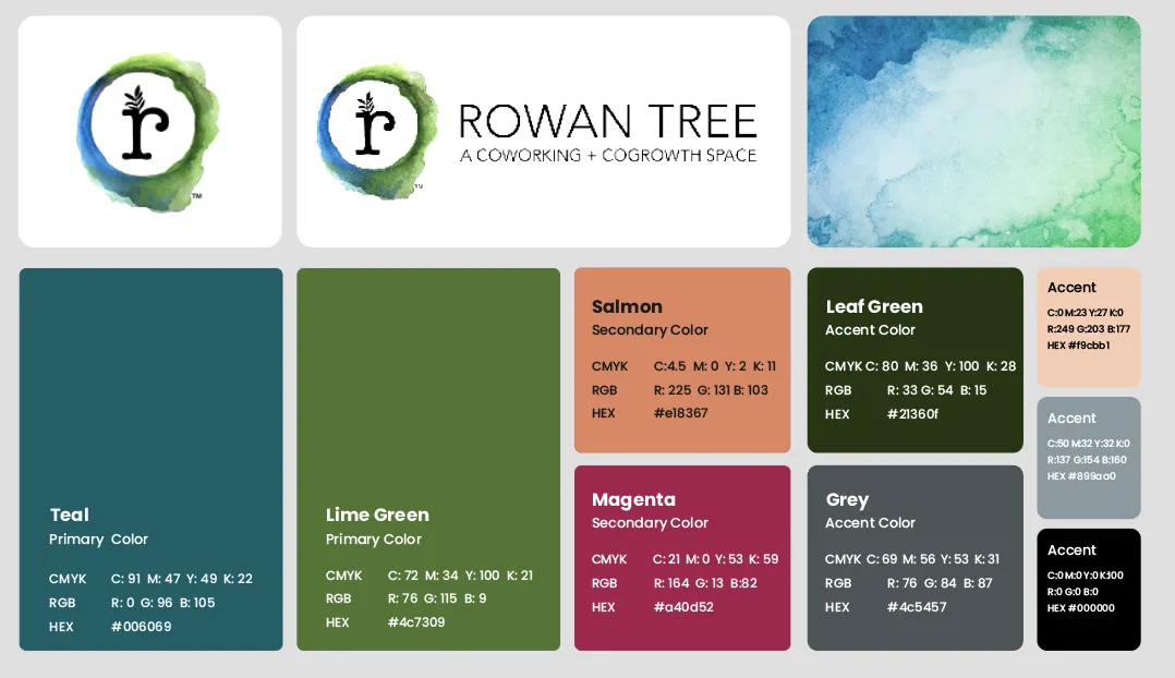
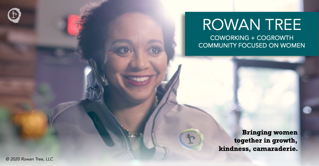
The visual identity paired bold teal, green, magenta, and coral with organic watercolor textures, natural materials, and playful details to create something warm and feminine without feeling pink, frilly, or precious.
And then there were the twinkle lights. Lots of twinkle lights.
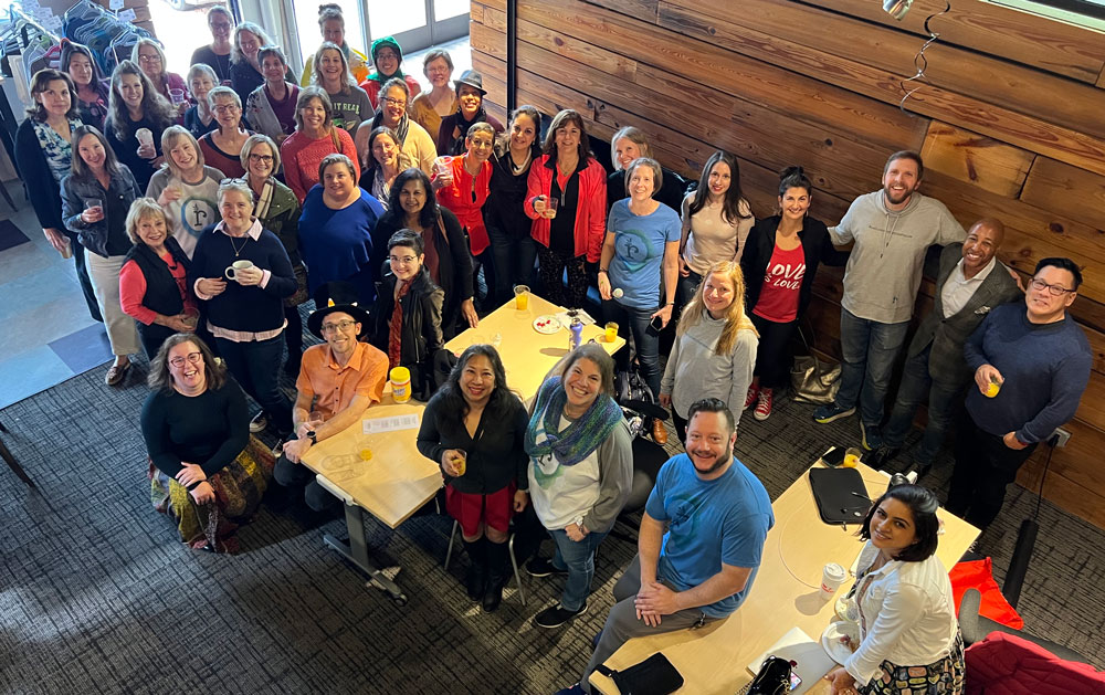
The physical space was filled with wood, bold color, warmth, and personality. Members often compared walking into Rowan Tree to Cheers: you were greeted by name, someone was genuinely happy to see you, and relationships mattered more than exchanging business cards.

What I Created
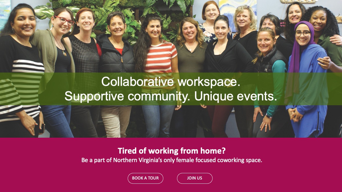
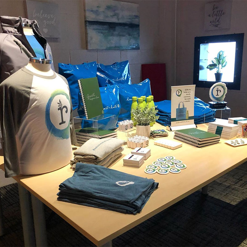
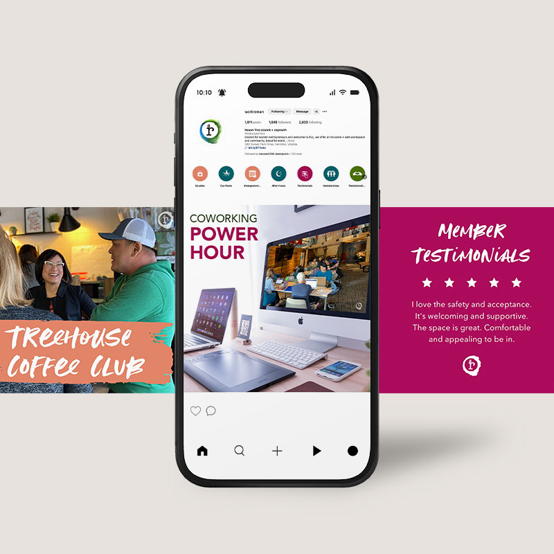
The brand touched virtually every part of the business. I developed Rowan Tree’s complete brand identity and voice, then brought them to life through the website, interior design and environmental signage, membership and marketing collateral, event campaigns, presentations, merchandise, social media graphics, and the countless everyday touchpoints that shaped how the members experienced Rowan Tree.
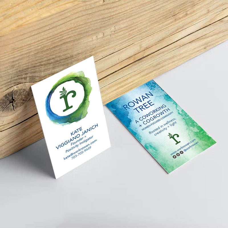
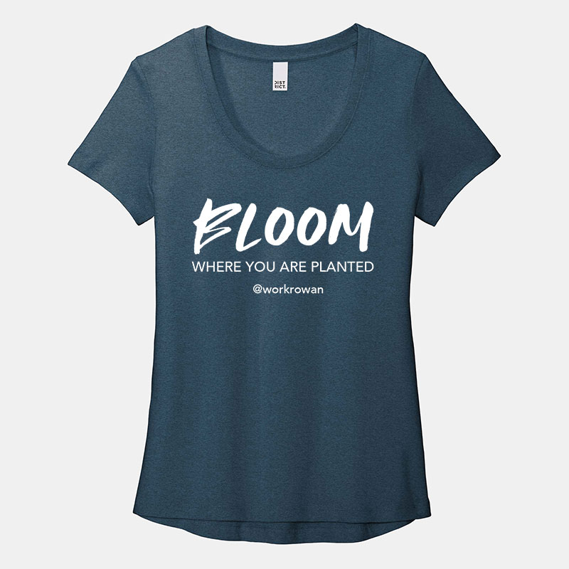
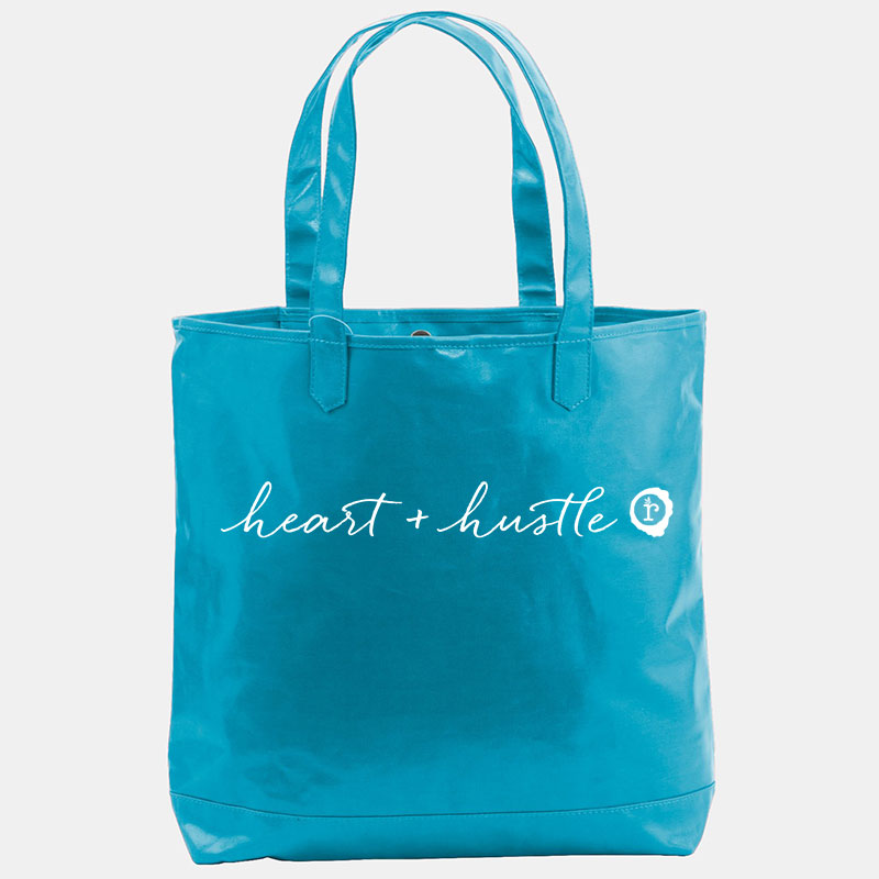
More importantly, the identity stayed remarkably consistent as the business grew. The logo and core colors never needed to change because they were rooted in who we were from the beginning. The system was flexible enough to evolve around them while remaining unmistakably Rowan Tree. The brand sheet shows that breadth, from the core identity to business cards, apparel, tote bags, event and membership graphics, and environmental signage.
The Impact
At its height, Rowan Tree grew to:
150
MEMBERS
85%
RETENTION RATE
500+
HOURS OF PROGRAMMING
$38K
FUNDING RAISED
But the impact I'm proudest of can't be measured on a spreadsheet.
Years later, Rowan Tree members still show up for one another.
What began as a brand and a physical space became a community with a life beyond either one.
“Before we even opened our doors, people thought we were an established business because we looked so polished. Amy wove together a look that was professional, heart-centered, and gorgeous. She knows how to tell a story visually, creating something you didn't even realize you needed. She puts her heart into her work, and it shows.”

"Having access to the entire Rowan Tree experience, the space, the people, the workshops, online and in-person has been instrumental in increasing my business savvy and confidence. I've learned that I need to be fully myself and clients will come, and they have!"

"I love that it feels like Cheers. When you walk in everybody says hello and when you accomplish even small tasks people are happy to join you in celebration ."

Take a Closer Look at the Rowan Tree Brand

Rowan Tree Wellness in Action